The Brand: good
The Mission:
As we were developing Upness, we suddenly hesitated on the target demographic…
What if we wanted to change gears and target an older group of customers, maybe a customer type that doesn’t know much about CBD and might be doubtful about it? Maybe a group of users would consider our products for pain management more than cosmetics?
The Process:
The solution to this mission was of course to develop a second brand!
Or at least to develop a second brand identity. This time profiling a customer with different expectations and a lack of trust.
I knew that the pharmaceutical look was gonna take over, but I wanted to keep it light with a few colors integrated into packaging and digital assets. Nice, elegant photography, departs from the “medicine” look, and gives a place for storytelling.
The Identity:
We debated for a long time regarding the name of this brand. We wanted something short, and that would be the opposite of Upness. Something moderate, and emotionless, but that inspired the appeased feeling our products procure. Good was actually great.
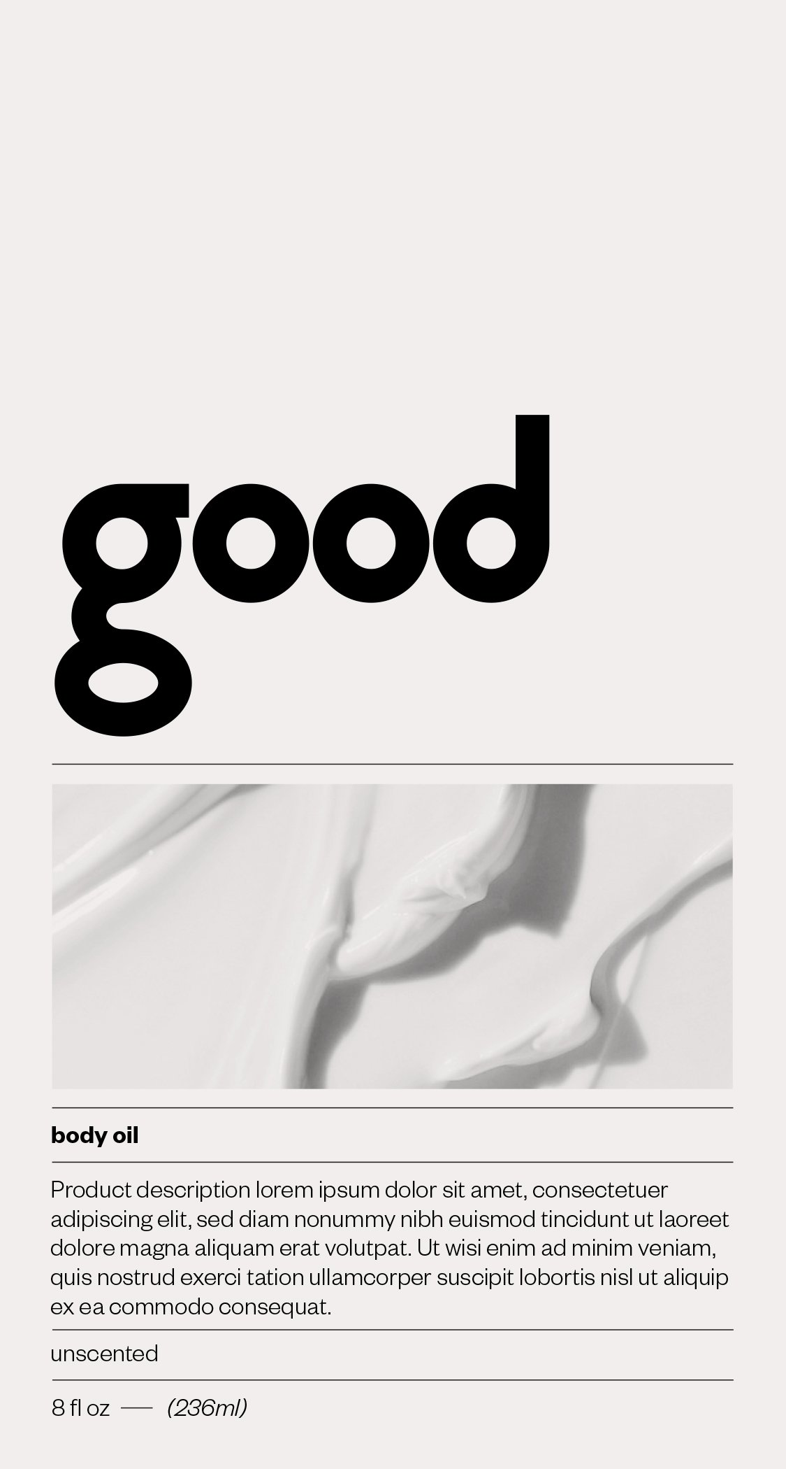
Now how do we give a little groove to a pharmaceutical-inspired look? We design a logo with a vibe. With the double o of good encased in between a g and d, it was perfect to insist on the quadruple loop, which gives the word a playful feel without being forced.
The Palette:
Because this is a mirror brand to Upness, we have the same need for a generous Color Palette, for categories and ingredients coding. Only this time we leave the pastels behind for something more muted, and earth-inspired, again with a clear retro vibe.
The Fonts:
Koliko is the logo font, which we intended to be used only for the logo. As a primary and unique font of usage, I was looking for a simple sans-serif, that would somehow remind me of Koliko in a subtle way. Mainly through the loops of o, g, p, d, b, …
Chronica Pro met all the desired requirements being as well a compatible Adobe font.
The Photography:
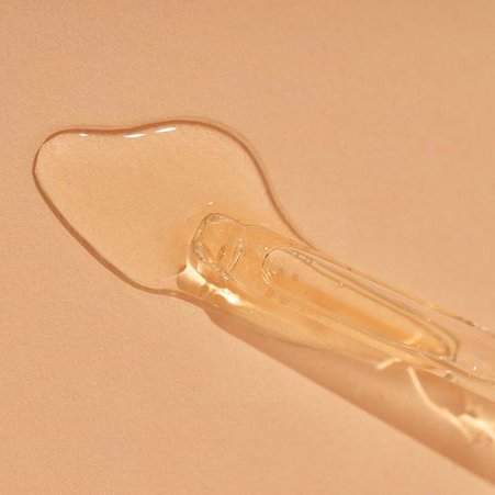
Considering this Brand has never been pushed live, all the photography is for Direction only. Directly inspired by other projects, or rendering. This is a moldboard to support the Brand Identity.
Product Development:
The product development phase for this Brand never passed the level of concept. But just like for Upness we were aiming for a sustainable packaging option, with glass and second-life plastic.
The caps of each component host the color coding, keeping the deco on components minimal, and mainstream Black on the white or clear components.
The Website:
The website we imagined was simple but elevated to a higher design look featuring divider lines, and colorful background to match the color coding of the products’ caps and primary packaging.
An utilitarian look was the goal, with a robust search and filtering navigation.


