The Brand: Qlaude
The Mission:
To imagine an eyewear Brand, focusing on both sun and eye glasses.
The Process:
The direction for this project was rather vague and open-ended. So the first thing I did was to look at the competitor’s landscape in the eyewear industry. And just like for Beauty, it was crowded!
The only relaxed spot was the middle ground in terms of price-point, or what we could describe as “entry-level-luxury”, not too busy there, but all very much out there in terms of design, and trends.
So I decided to set the camp in that exact zone, only, I went for an esthetic that would go classic with an avant-garde edge. Something that allows to surf on trends if we want to, even create some, why not, but overall with the desire to stay classic and relevent.
The Identity:
When I picked the name of the brand, I wanted it to be a first name, something that could be or become familiar. I also wanted a foreign name, my French background, naturally drew me in that direction, plus it fitted the desire for timelessness and classic style. Finally, I wanted the name to be unisex.
Claude came to me almost naturally, but the spelling didn’t seem to do anything no matter what typo I was applying to it. That’s when I decided to switch to a Q, and push the stylization even further by cutting its top with a dramatic angle.
The Palette:
The Brand Palette is extremely purist, Black, Off White, and White. Those will always be applied to all assets, at all times. In addition, I wanted to have a Seasonal Palette, curated to match our trends and storytelling.
Qlaude, a fashion brand, needs to be approached with that trend integration in mind.
The Fonts:
Caslon 540, the classic mid-century beauty, is the font that was used to build the logo. It was then logical to carry it through the rest of the brand identity.
Without a bold option, I added the Italic variation in our rules to allow play with nuances.
In complementarity, we added Futura, and another retro giant, which clashes with Caslon on purpose. The goal is to englobe the brand in that classic feel, with a typography treatment that stands out.
The Photography:
Unfortunately, the brand has never been to the point of launch, and we never got to shoot an actual campaign for it. But here is an inspiration moldboard to represent the photo profiling and treatment we are aiming for. Retro feel again, with a warm color or grey scale treatment, both layered with a grain touch.
Product Development:
A big part of the Incubation process is of course defining the products. When it comes to Beauty, both formulation and packaging matter, and must be connected to the Brand identity at all times. As we aimed to set OFIR at the confluent of performance and clean beauty, we wanted to design building blocks for any beauty routine.
Our packaging results from an endless curation, to find the most unique and interesting shapes, to which we added the minimal look of a White Deco on Black Glossy. Silver and Gold accents are added here and there, for some foreseen hero products in the line.
The Website:
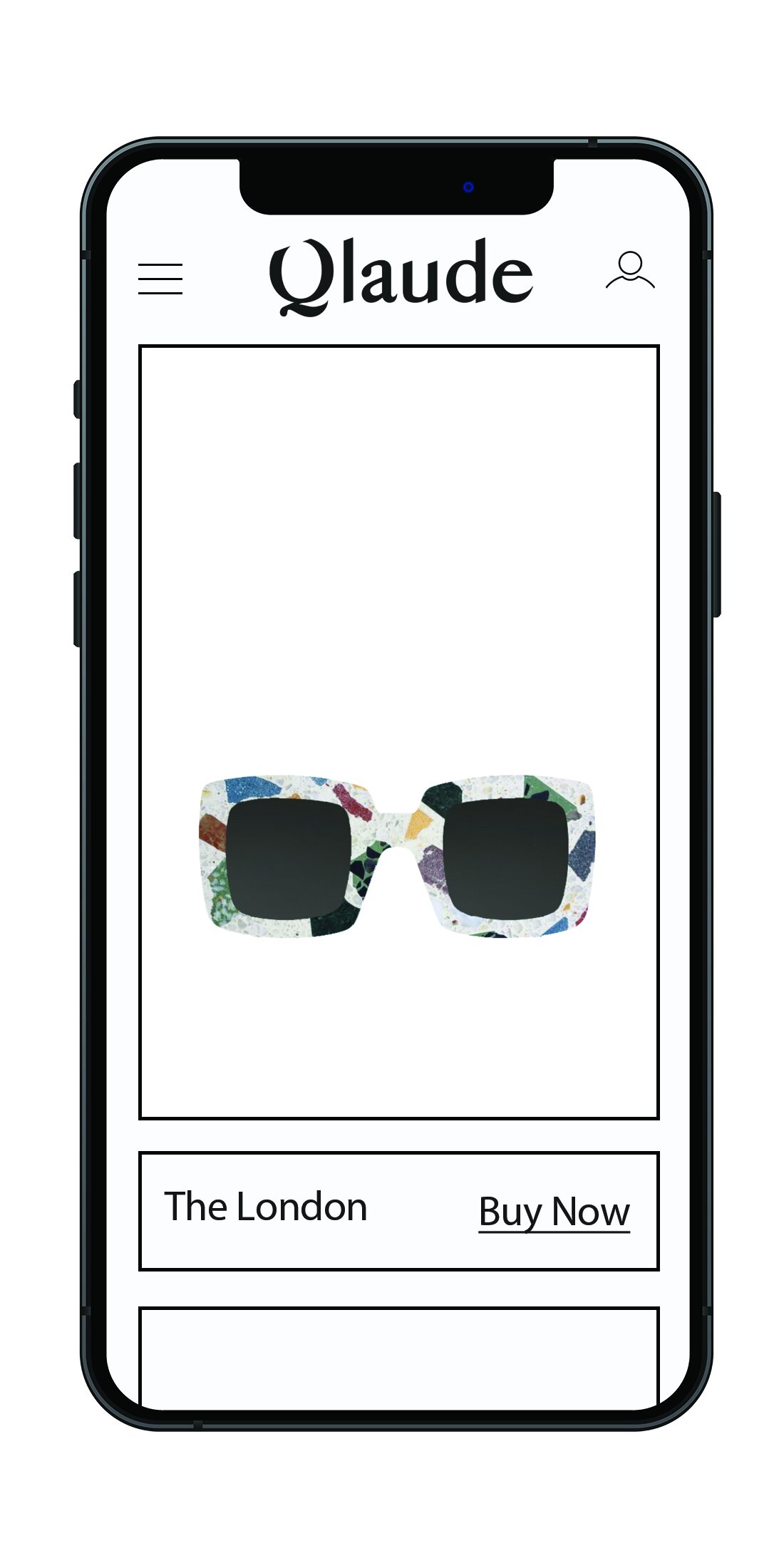
The vision for the website is to be extremely clean and minimal, making the customer’s funnel as simple and straightforward as possible.
Print Ads:
Our Ads design reflects the minimal look of our website. But with Print, we have more freedom to play around with composition and hierarchy.
I love the idea to go very contemporary with a broken grid, almost random-looking, in contrast with our choice of fonts that is almost requiering a Swiss design grid.
Emails:
Our emails, even though more structured, are following the same line of design as our ads, while fitting the digital limitation as our website does.


