The Brand: Water Friend
The Mission:
To imagine the identity and packaging design of a Sustainable Brand selling laundry sheets and possibly other detergents and cleaning products.
The Process:
This was a quick project as we had to decide whether to move forward or not with a potential partnership on this Brand.
The name Water Friend was available in the space and perfectly translated to this brand's goal: preserve the environment, nature, and more specifically our Water.
I wanted the packaging to translate that delicate relationship to nature, but also to be sustainable and visually pleasing. Most of the competitors in that category have generic branding, featuring some vivid shades of green and blue.
As much as I wanted to use the color codes of that category, I also wanted to make sure our product and brand would stand out in a google search or on a shelf.
The Identity:
WATER FRIEND is a brand that is about protecting Mother Nature, so representations of that Nature are present on any assets and media. The logo is simple, created from Expletus Sans, a display typeface by Google.
I am adding graphical elements such as digital line drawings, that are again “nature-inspired” but obviously computer made, to represent the ambivalence of the modern world we live it.
The Palette:
Like I said, most of the competitors in the space, are using the color coding of Blue and Green. Just like fast food use red and yellow, these color choices make sense.
That being said, I didn’t want to stick to the vivid shades often used, but rather deep and darker shades, next to it, a soft Almond and Light grey to keep it all muted, and more neutral than screaming.
The Fonts:
Expletus is our primary font, as it is our Logo font, and would be used for any Title, Slogans, or Headlines. As a supporting font, we selected Outfit is a geometric sans serif by google as well, that compliments Expletus curves perfectly.
The Photography:
High-end nature photography is what our brand is about. Shots reminiscent of National Geographic images or vintage Patagonia ads. Colors, and textures, are so crisp that you can smell and feel them, and ultimately want to protect and preserve them.
It is an effective way o pass our message, but also to elevate our brand compared to their competitors.
Product Development:
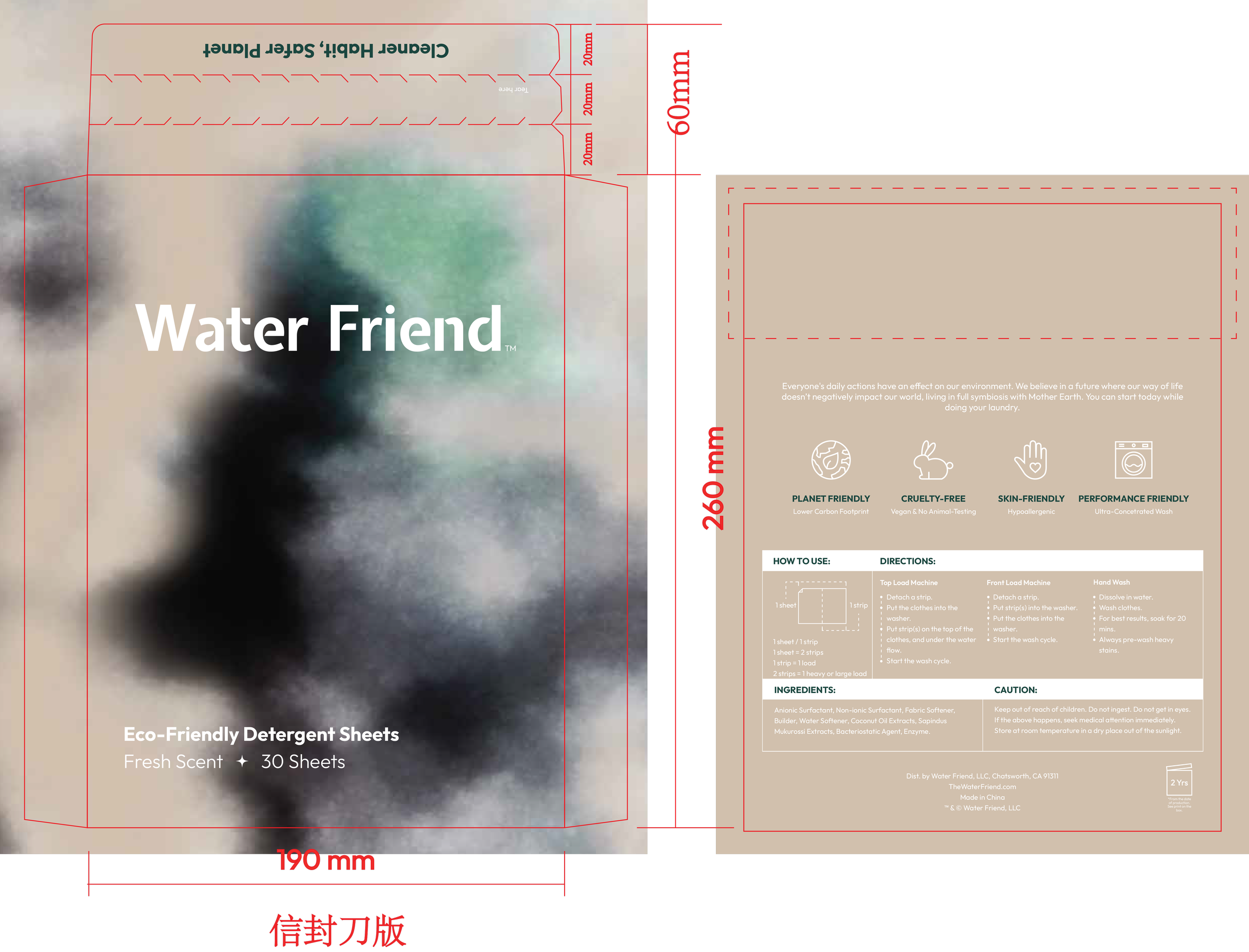
We developed several directions for the laundry sheets envelope. After several tests and studies, we opted for the tie-die diffused look, on natural craft paper from sustainable packaging. We imagine that the color appearing on the artwork, blue in the case of the “fragrance-free” option, can take different shades and look depending on the scent or specificity.
Online Ads:
It is difficult to imagine something as granular as an online ad, directly conditioned by its purpose, funnel, and target, but here is a quick look at the graphical treatment of eye-catching content that emerged as we developed the brand.


